I promised a post about my color choices and @ALB asked for a little more detail, so here's a bit on my reasoning, a tiny bit of color theory, and a healthy dose of opinion. Scroll to the bottom if all you want to know is what colors I chose, I won't take it personally  .
.
Why Are Some Colors Polarizing?
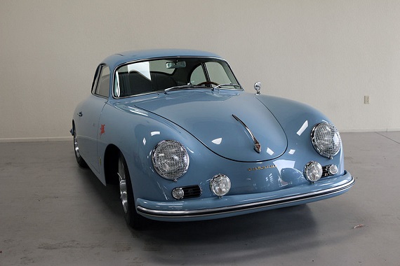
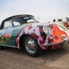
Face it, some colors everyone can live with, or nearly everyone, and there are some that have equal measure of haters and devotees. Why is that? I think in large part the problem stems not from the color itself, but where you put it. In our case we are putting it on something that we see as an iconic object and each person brings their own expectations to the viewing. For example some the traditional German racing silver paint scheme is so attached to their vision of this car that anything else seems a travesty. For others a childhood experience, say an uncle’s black speedster, is so inextricably linked to their vision of the car anything else looks less appealing. With this object we are also looking at something that everyone sees as being of a certain vintage. Therefore we expect color combinations and finishes that look like they are from a certain period and we would likely find a modern color-shifting paint in a matte finish off-putting. So one’s goal for their build and their experience with cars of this era will obviously have a great deal of impact on their choices for paint, upholstery, etc.
My primary goals are:
- An outlaw look. This will give me more leeway than someone doing a stock look.
- A finished project that has a cohesive look and makes all associated with it proud.
- A car that can easily be sold may years down the line.
- A unique take on the classic color pallets (I don’t want to see myself coming and going, but I don’t want people to see the car and go WTF was he thinking?) I want it to rhyme, if you will, with the classic choices available.
This goals first approach gives me the parameters within which to evaluate color choices. The outlaw goal opens up some choices, plus it gives me some interesting sources to look at for inspiration. There are people that do this kind of thing REALLY well. I’m thinking Rod Emory when his customers let outside the silver and black box (for instance the John Hall outlaw) and Singer when the customers give them free hand. So I won’t be put in the “It has to be an official Porsche paint code” box unless I want to get in it.
The resale thought puts some constraints on the project. I don’t expect to ever sell this car unless I can no longer drive it (my left leg falls off, or I start driving a pine box). At some point, though it will happen. This rules out polarizing classic colors like Stone Gray, Fjord Green, and modern choices like metal flake metallics and color shifting pearls. This goal is also in tune with the idea of making choices that rhyme with the classic color combinations available in the 50's.
So where did I look and where did I wind up? I looked at all the classic Porsche colors, the newer iterations of the classics in their PTS series, and some of the modern ones. I looked at colors in other makes that are doing interesting things with modern colors that have a vintage vibe, like Subaru, Toyota, Mini, Volkswagen, and Jeep. In every case I tried to see the color in person. I looked at other builds on Instagram, youtube, etc. The computer screen can only give you a rough idea of if you're in the right color neighborhood (and that assumes that the person posting the picture has even identified the color correctly). There’s nothing like seeing it in person. You really must do this! If you can't see a car in a particular color, then order a spray can of touch-up paint in the correct code and spry a nice big piece of cardboard. Carry it around and look at it in differing light conditions.
Don't trust your computer! A painted object creates color by a subtractive process. It reflects only portions of available light, subtracting the other wavelengths by absorbing them. That’s why paint looks different in changing light; there’s more or less of the spectrum to be reflected, or only certain parts of the spectrum available. A computer screen uses an additive process, shining various amounts of 4 base colors along with black to add up to the desired color. Adjust your screen brightness to see a color change subtly. Plus the digital cameras are using different sets of sensors and different software to capture a hue. Then there’s sending the image by various compression methods. Most members here will remember that a photo taken at the same moment with Ektachrome, Kodachrome, and Polaroid films would look very different. It’s a similar effect except the variations are endless. So the computer screen screen is a rough cut tool only, unless you do design work, have expensive calibration software running, and have controlled the photography process.
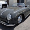
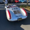
Anyway, I kept coming back to two different grays; a vintage Porsche color known as Modegrau or Fashion Gray, and a modern car color called Lunar Rock . They are both very rich grays with overtones of green/tan/khaki. They change A LOT in differing light conditions. Funnily enough when I mentioned Fashion Gray to Greg he said, “You have to see this!” and dragged me out to the yard to uncover a friend’s coupe build painted in Fashion Gray. It looked really good. Rumor has it that Greg will be taking his friend’s coupe to the SLO west coast gathering, so those of you there can get a bit of a preview. Anyway, I found myself in the classic Porsche color chart after all, but the process makes me really confident in my choices. This should look striking, yet "right", individual, yet not odd, and it definitely rhymes with a classic 356 look. A future owner could easily add the chrome trim, paint the wheels silver, put on hub caps, and go a completely different route. The rest of the color choices are below.
-A classic carpet; the #316 medium/dark gray German square weave
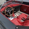
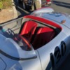
-A beautiful dark, deep red leather that Greg has sourced called Medium Red
-A Light gray headliner. I’m letting Greg make this aesthetic choice when he has samples in to look at. I totally trust him on this.
-A set of Black powder coated Vintage 190 wheels, no hubcaps
-A deletion of the chrome from the window trim on the windshield and rear window
And there you have it. I’d love to hear your thoughts!
-Michael
![]() ). Peloquin started as a VW mechanic and he made a unit for air-cooled VWs decades ago. He moved on to making ones for liquid cooled VWs and this is the Type 1 transaxle version of his latest.
). Peloquin started as a VW mechanic and he made a unit for air-cooled VWs decades ago. He moved on to making ones for liquid cooled VWs and this is the Type 1 transaxle version of his latest.


