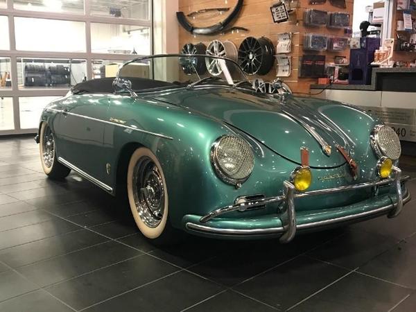
Love the look of this car.....a winner indeed..I LOVE towel racks
Classified postings do not allow for discussion (replies are not allowed). Direct message the member if you would like to discuss the item.
The Classified section is open to any individual (non-commercial firms) posting of items for sale. Members posting commercial advertisements must be enrolled in a Supporting Merchant program.
Postings without relevant details (PRICE, location, condition, etc.) will be deleted.
Replies sorted oldest to newest
i think Ferdinand just rolled over, just my .02 worth
EBay listing is bizarre:
no pics with top up or side curtains installed.
A/C install in this car is silly
no pics in either boot, engine, etc
no info on donor engine/wiring harness, etc.
is this a true “tubaru” ?
stated as auto, but 3 pedals are visible
a bit peculiar![]() and obviously a manual transmission but whats wrong with A/C? Lots of folks have A/C in their speedsters
and obviously a manual transmission but whats wrong with A/C? Lots of folks have A/C in their speedsters![]()
Lots to like about it imo. Your mileage may vary....
Beautiful car, but the gap on the front hood seems larger than normal.
Troy Sloan posted:Beautiful car, but the gap on the front hood seems larger than normal.
You are exactly right on the gap issue...unfortunately![]() ...I wonder if that can be finessed a bit or is it a done deal?
...I wonder if that can be finessed a bit or is it a done deal?
I would love to install the towel bars on mine. Then again, I’m sure I could easily put the $4k somewhere else.
I recently saw on Instagram what appears to be a “real” speedster very close to my color with the towel bars.
Attachments
The white walls are a bit much for me, especially given the overall level of bling. I wonder if the "frunk" is not fully latched, and is being held down by the straps. The paint is certainly pretty.
In at least one of the door pictures the gap also seems excessive.
I agree with Lane that the white walls are a bit too much. I've only seen them once on a Speedster where I thought they looked good. It was a dark blue Vintage.
My question is why doesn't the exhaust go through the bumper overriders in the rear?
Don't like the color, but that's a matter of taste, as are the whitewalls(ewww!)
Troy Sloan posted:In at least one of the door pictures the gap also seems excessive.
I agree with Lane that the white walls are a bit too much. I've only seen them once on a Speedster where I thought they looked good. It was a dark blue Vintage.
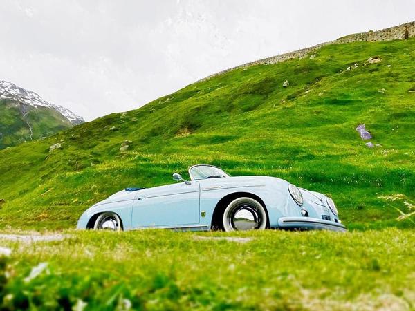
I don't know @Troy Sloan. @Ketan's white walls are on point.
Same with @Cory McCloskey's:
That said, I don't think I could pull it off. But white walls on silver or light blue look great to me.
Attachments
Thanks @Ryan (formerly) in NorCal! Mine are inserts that are slightly slimmer. It's one of those things that you either love or you hate. @Troy Sloan is right in some ways. I see some cars, and think they'd look better without. I like mine because they make the wheels look larger. From far/some angles, they just look like the rims.
Carey Hines brought a car to Carlisle with wide whitewalls, and it looked great. I guess it really depends on the car. Maybe this one is the green combined with the foglights AND the towel bars that I don't like.
Ketan posted:I see some cars, and think they'd look better without.
Not all of us can be as cool as @Ketan.
Weird ad.
"Totally Reconditioned VW IRS 5 Lug Chassis." "New Original Style 5 lug Wheels with 185 x 15 Tires Moon Hubcaps"
--they're 4-lug Mangles dressed as Rudge knock-offs. No hubcaps.
"New Wood Rim Steering Wheel" but shows a Flat-4 banjo.
The wheels and the steering wheel look fine, but the ad copy doesn't match.


